
Carbon Compass
A mobile system that delivers real-time carbon insights at the exact moment of decision, bridging the gap between climate intention and everyday behavior. Carbon Compass transforms abstract environmental data into concrete, actionable guidance through product scanning, personalized suggestions, community challenges, and progress visualization.
"I know climate change is important, but it's hard to see if what I'm doing actually matters."
- Research Participant
This project explores how behavioral science, immediate feedback loops, and social accountability can turn passive climate concern into sustained, measurable action.
Result
The hi-fi prototype achieved a SUS score of 83.75 - rated “Excellent” and placing in the top 10% of usability evaluations across 8 participants. The scanner was the fastest-completed task, validating the core hypothesis: at-the-moment carbon feedback is intuitive, not effortful.
- Role Behavioral Designer & UX Researcher
- Team Vivian, Tanzeel and Blessing
- Tools Figma, Miro, Taguette, Optimal Workshop, Zoom
- Timeline Fall 2025
- Focus Behavior Change, Gamification, Sustainability
- Methods Contextual Inquiry, Competitive Analysis, Usability Testing, SUS Evaluation
- Status Hi-Fi Prototype Complete
The hard calls, and how I made them
People consistently expressed genuine concern for sustainability and still couldn't act on it. The whole product is built against the intention-action gap, designing for the moment motivation runs out.
Carbon is an abstraction nobody can feel. Users cared, but had no measurable understanding of their own footprint, and percentages meant nothing at the point of choosing between two products.
How I solved itConcrete comparison instead of abstract measurement: "this product has 40% less carbon impact than your usual choice."
Principle: Abstract to concrete, meaningful comparisons, not percentages.Feedback arrived long after the decision. Every competitor either tracks after the fact or educates in the abstract. Neither reaches the moment the choice is actually made.
How I solved itThe scanner delivers the insight in the grocery aisle, at the exact moment of decision.
Principle: Temporal proximity is critical for behaviour change, this was the core hypothesis, and the one SUS 83.75 validated.Understanding carbon accounting isn't the user's job. Explaining the methodology adds load without changing behaviour; people need a decision, not an education.
How I solved itSimple flows and chunked information that answer which product is better and why, without teaching carbon accounting.
Principle: Reduce cognitive load at the point of action.Solo tracking runs out of motivation. Individual tracking depends on willpower that fades, and community turned out to matter more than expected, "challenges make it more fun."
How I solved itCommunity challenges were treated as essential infrastructure rather than a secondary feature.
Principle: Behaviour change is social before it's individual.Design principles & psychology at work
The behavioural science the product is grounded in:
- Intention-action gapThe design target is the distance between caring and doing, not awareness.
- Friction removalSuggesting lower-carbon alternatives in the same store makes the sustainable choice the easy one.
- Timely nudgesInsight is delivered at the decision point rather than in a weekly summary.
- Designing for when motivation runs outThe principle this project produced, and one I carry into every behaviour-change product since.
01The Problem
Climate change demands individual action, but most people experience a profound disconnect between caring about the environment and understanding how their daily choices contribute to it.
Across my research interviews, users consistently expressed genuine concern for sustainability, yet lacked clarity, urgency, or any measurable understanding of their personal carbon footprint.
The Perception Gap
- • Carbon footprint feels like an industrial problem, not personal
- • High-impact behaviors (diet, transport) systematically underestimated
- • Low-impact actions (lights, recycling) systematically overestimated
- • Users rely on intuition rather than structured tracking
- • Motivation evaporates without visible progress
Competitive Gap Analysis (12 Products)
Every competitor either tracks after the fact or educates in the abstract. No product delivers a personalized nudge at the moment of purchase. That temporal proximity is the design hypothesis Carbon Compass is built around - and the one the SUS 83.75 score validated.
02Research & Discovery
I conducted 5 contextual interviews that revealed three distinct user archetypes:
Time-Pressed Students
Jill Archetype
- • Want guidance without effort
- • Struggle with cost vs. sustainability tradeoffs
- • Prefer "quick wins" fitting packed schedules
- • Barrier: Time pressure, unclear impact
Budget-Conscious Families
Joel Archetype
- • Seek intersection of savings & sustainability
- • Need credible, trustworthy information
- • Want to reduce household waste efficiently
- • Barrier: Information overload
Value-Driven Consumers
Heather Archetype
- • Already highly motivated
- • Want measurable progress
- • Committed to long-term change
- • Barrier: Maintaining motivation over time
03Early Sketches & Ideation
Before diving into digital prototypes, I explored dozens of concepts through paper sketches, testing layout hierarchies, navigation structures, and information density.
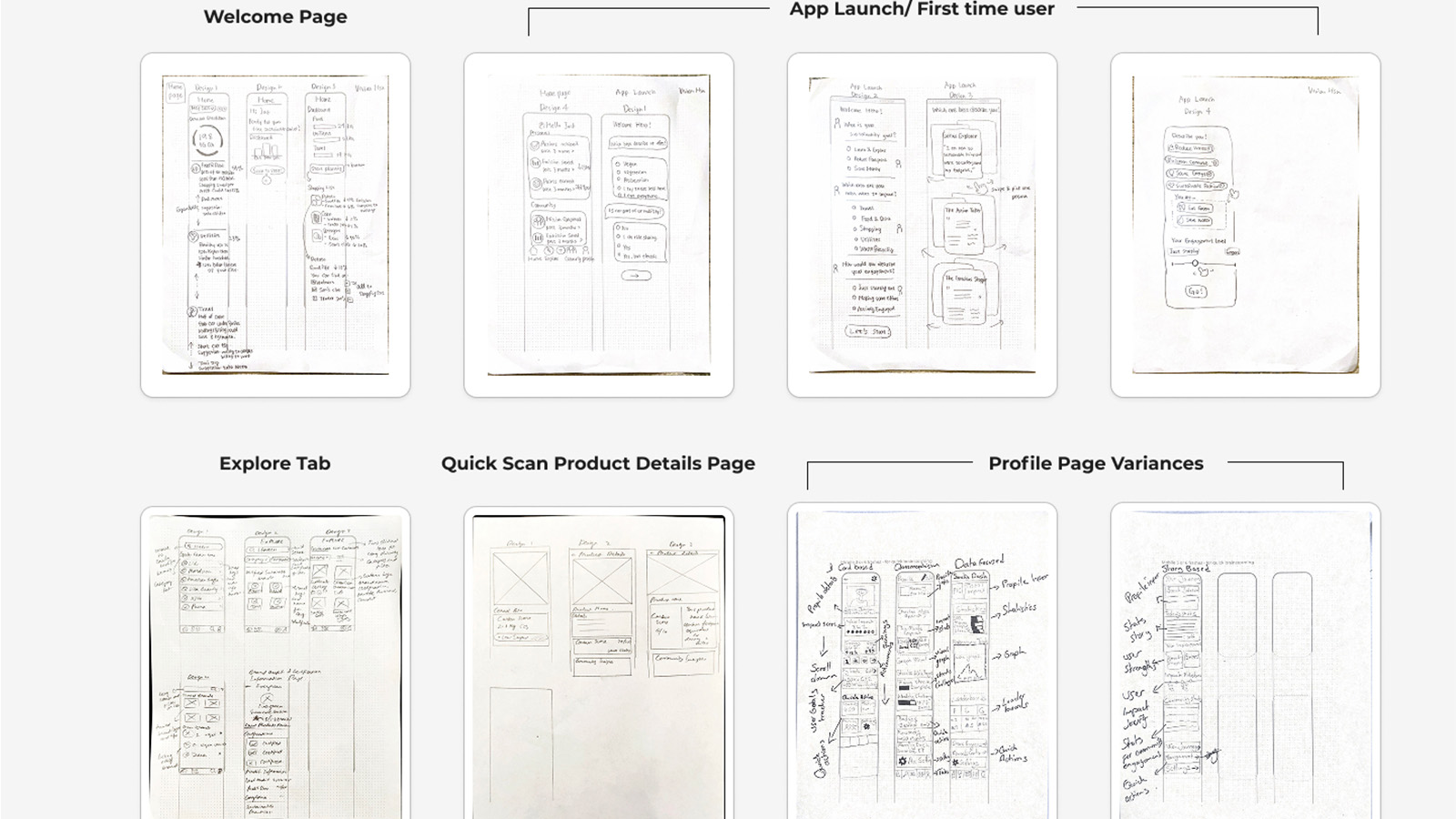
Sketches: Welcome Page, App Launch/First Time User, Explore Tab, Quick Scan Product Details, Profile Page Variances
04Design System
A comprehensive design system ensures consistency across all screens while maintaining the welcoming, earthy aesthetic that resonates with sustainability-minded users.
Moodboard
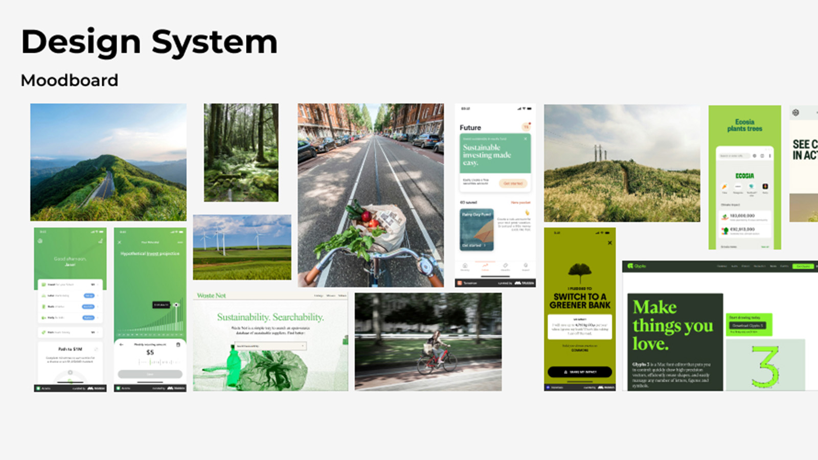
Visual inspiration: Sustainable investing apps, eco-friendly lifestyle brands, nature photography, earthy color palettes
Color Palette
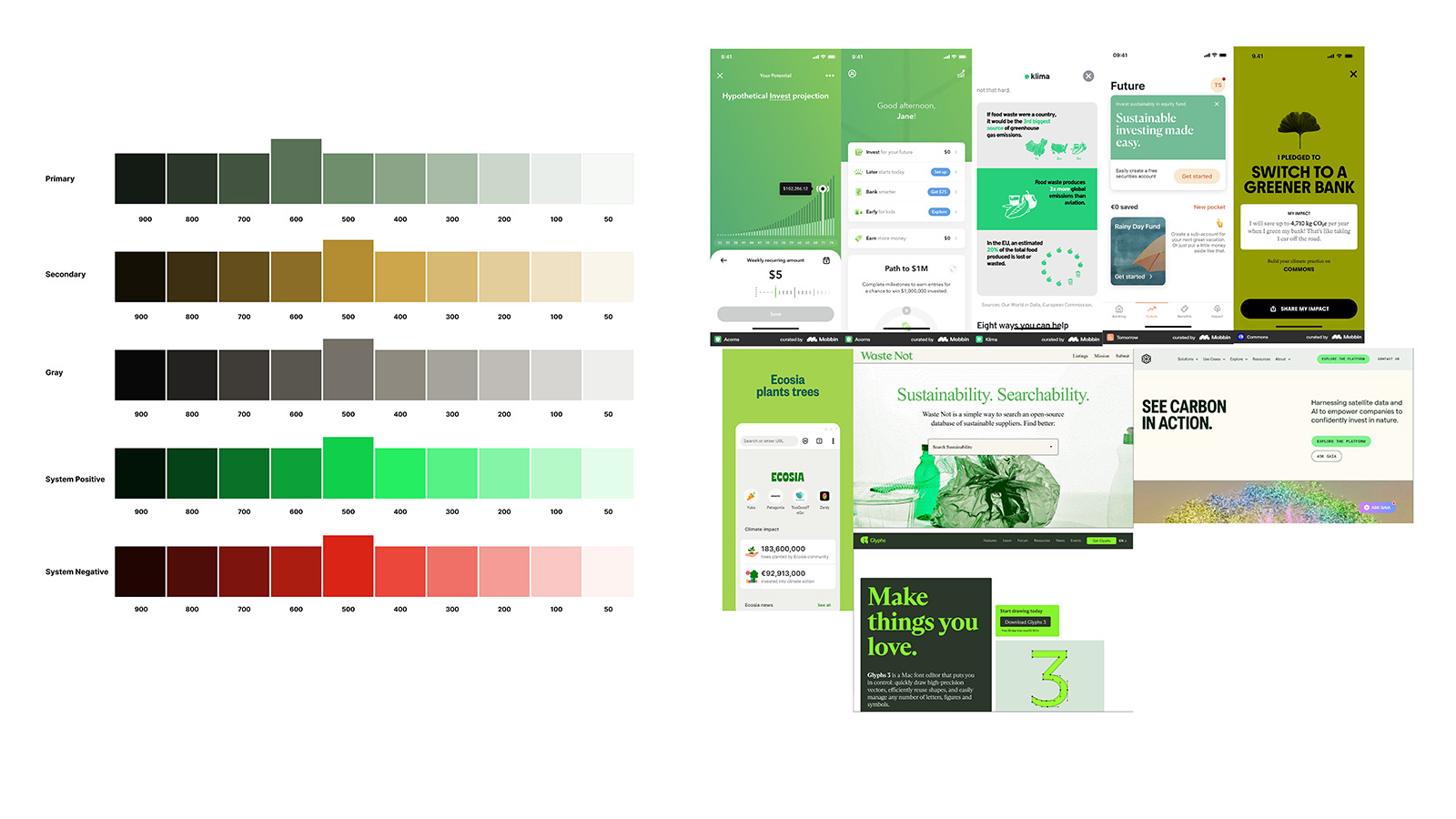
Primary, Secondary, Gray, System Positive, System Negative scales (50-900)
Typography
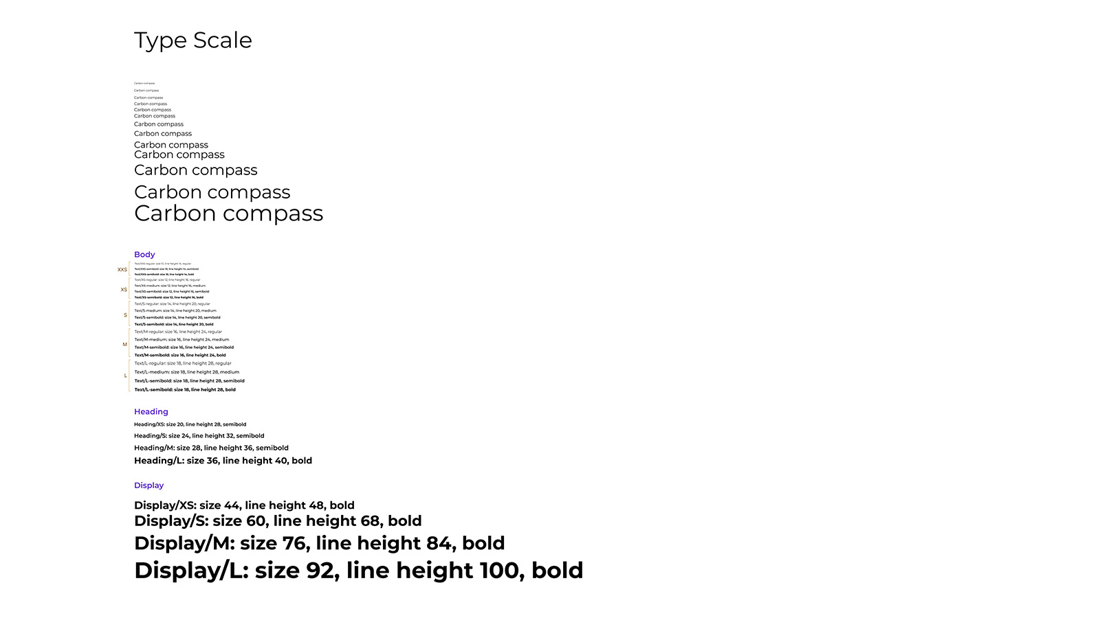
Body, Heading (XS-L), Display (XS-L) scales with line heights
Icons & Components
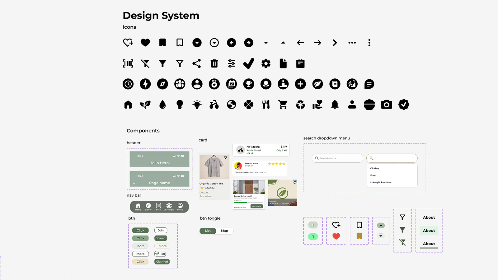
Components: Header, Nav Bar, Cards, Search Dropdown, Buttons, Toggle States, Icon Library
Mobile Layout Grid
4-column grid with 16px margins and 8px gutters for consistent mobile spacing
Desktop Layout Grid
12-column grid with responsive breakpoints for future web expansion
05Design Rationale
Carbon Compass is grounded in behavioral science principles that address the intention-action gap:
Reduce Cognitive Load
Simple flows and chunked information. Users don't need to understand carbon accounting, they need to know which product is better and why.
Abstract to Concrete
"This product has 40% less carbon impact than your usual choice." Meaningful comparisons, not abstract percentages.
Immediate Feedback
Scanner delivers insights at the exact moment of decision, in the grocery aisle. Temporal proximity is critical for behavior change.
06The Solution
Real-Time Carbon Scanner
Point at any product to see carbon footprint instantly. Most intuitive interaction in testing.
Product Alternatives
Suggests lower-carbon alternatives at the same store. Removes friction, makes sustainable choices easy.
Community Challenges
"Challenges make it more fun." Social accountability drives engagement far more than solo tracking.
07Usability Testing
83.75
SUS Score - "Excellent" (Top 10%)
5.7/7
Average SEQ Score
8
Participants tested
#1
Scanner was fastest task
What Worked
- ✓ Simple primary navigation
- ✓ Clear scan interaction with instant feedback
- ✓ Goal-setting flow was intuitive
- ✓ Achievement tracking resonated emotionally
- ✓ Community challenges increased engagement
Issues Found
- ✗ Points system confusing
- ✗ Community tab naming misleading
- ✗ Goal settings too hidden in profile
- ✗ Product search lacked structure
- ✗ Gamification needs depth for long-term
08Qualitative Results
Core Value
Participants generally gave positive feedback on the app's core concept and design, finding its goals clear, the interface easy to use, and the overall experience motivating.
"I think it's pretty friendly for people who doesn't like follow up with this a lot during their daily life, and who have like, like me, not a lot of knowledge about this at all."
- P4
"I like the overall color scheme of it too, it's very welcoming and very earthy, just as sustainability should be."
- P2
Usability Feedback
Participants offered several specific suggestions for improvement regarding the intuitiveness of the information architecture, the clarity of data presentation, and details of the user interface.
"I expected to find tips and advice in the 'Community' tab, viewing the 'Explore' tab as a place for miscellaneous content, which caused confusion when looking for product recommendations."
- P5
"I want to see the challenge first and then I want to join the challenge... it's kind of scary for me."
- P3
"I found it difficult to locate 'alternative products' or 'recommended brands' because the wording didn't show directly, feeling like it was hidden too deep in the 'Explore' tab."
- P5
Feature Feedback
"I like the scan page. It is really cool to know that I can track my carbon footprint anywhere."
- P8
"For rewards, I wanted to see offers from nearby stores to know what is available locally."
- P5
"For the user interactions, you could use some kind of gamification... like adding some kind of incentives for the user, any kind of coupons."
- P3
"Maybe the community where we can share our tips or something like that with others."
- P1
"It currently shows what title or what achievement I did, but it doesn't show me what I performed to get that achievement... I want to know that."
- P2
09Design Evolution
The journey from lo-fi sketches to hi-fi prototype revealed critical insights about what users actually need versus what designers assume they want.
Lo-Fi Prototype
The low-fidelity prototype focused on testing core user flows, layout hierarchy, and overall app structure before refining visuals. Key elements: initial navigation layout, basic scanning flow, early points/rewards concept, and preliminary product browsing.
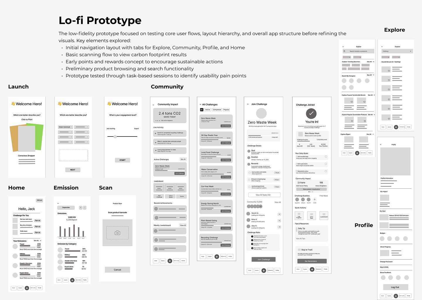
Lo-Fi Screens: Launch → Home → Emission → Scan → Community → Explore → Profile
Hi-Fi Prototype
Key updates based on testing: Explore renamed to Brands for better visibility; Community renamed to Challenges; simplified navigation bar; enhanced product search layout; refined points and rewards placement; adjusted homepage hierarchy.
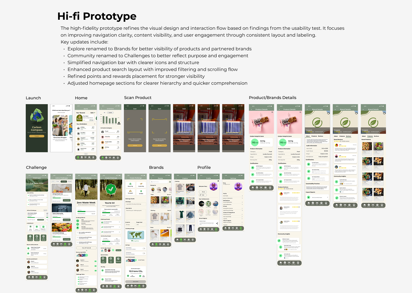
Hi-Fi Screens: Launch → Home → Scan Product → Product/Brand Details → Challenge → Brands → Profile
Final Design Improvements
Based on usability testing insights, four key improvements were implemented to address navigation confusion and information discoverability:
1. Liquid Glass Nav Bar
Changed nav-bar design to liquid glass style to create visual hierarchy and depth, making navigation more intuitive.
2. Explore → Brands
Renamed the Explore tab to "Brands" to strengthen commercial connection and make product discovery more intuitive.
3. Community → Challenges
Renamed the Community tab to "Challenges" to strengthen gamification and motivation, making purpose immediately clear.
4. Categories Upfront
Restructured the 'Brands' tab to feature categories upfront (Food, Clothing, Shoes), preventing key information from being hidden.
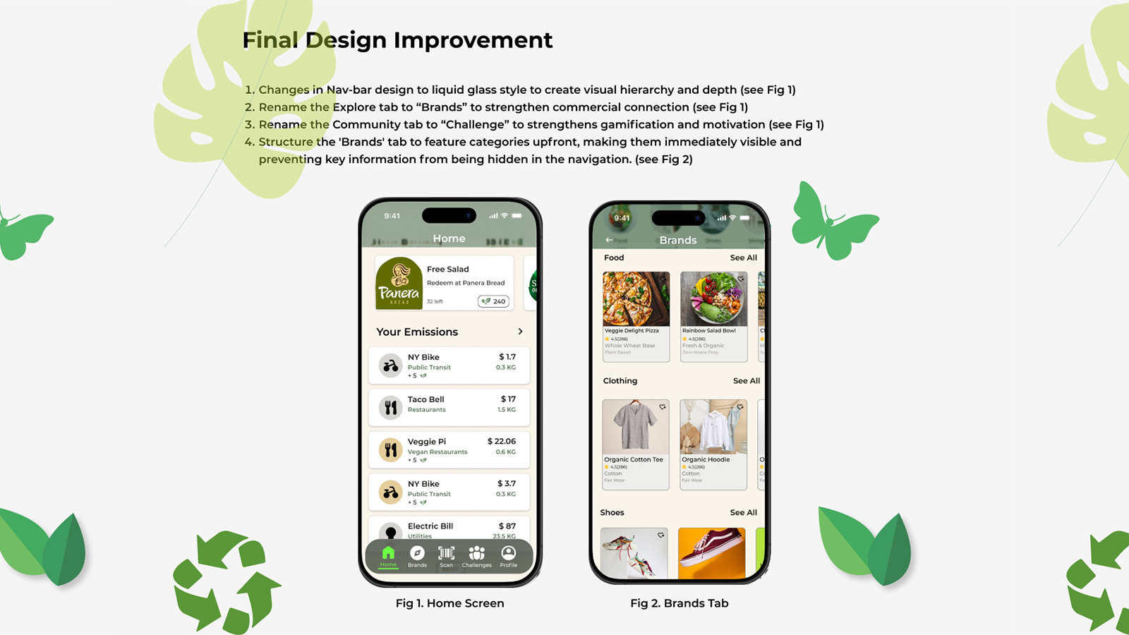
Fig 1. Home Screen with Liquid Glass Nav • Fig 2. Brands Tab with Categories Upfront
10Reflections
I started believing information was the primary barrier, that if people understood their carbon footprint, they’d act. Research dismantled that assumption fast.
Information without action pathways creates guilt, not change. The breakthrough came when I stopped designing for understanding and started designing for the next small, specific, achievable step.
The most surprising finding: social features drove engagement far more than I expected. Community challenges weren’t secondary, they were essential infrastructure. Behavior change is social before it’s individual.
This project sharpened a principle I carry into every behavior, change product now: you are not designing for motivation, you are designing for the moment when motivation runs out. Friction removal, timely nudges, and visible progress aren’t nice-to-haves, they are the product.
Key Takeaway
Aggregated across millions of purchase decisions, individual choices become market signals. Carbon Compass is a prototype for turning personal intention into collective impact.
SUS 83.75 places Carbon Compass in the top 10% of usability scores. The concept and the interaction model are validated. The next phase is proving the behavior change is real.