
Riches & Beyond
I was the UX researcher and designer behind Riches & Beyond, turning a live, in-person property-investing masterclass into The Property Game Tribe, a paid online learning platform that reached 50,000+ students in its first year.
This is where my product design career actually started: 2.5 years, before I specialised in AI systems and safety-critical interaction design. No AI in sight here, just research, UI design, video production, and a small team shipping a real, revenue-generating education product to real people, in production, with real trade-offs.
Riches & Beyond ran successful in-person masterclasses teaching people how to invest in property, auctions, credit and bond applications, Airbnb arbitrage, estate planning. It worked, but it didn't scale: it was bound to a room, a date, and whoever could travel to be in it. My job was to take that program and turn it into something people could learn from anywhere, without losing what made the live version work.
Product Snapshot
- • Problem: Property investing knowledge wasn't accessible, not written down anywhere, not explained in plain terms, and wrongly assumed to require capital people didn't have.
- • Solution: A self-paced LMS built on Moodle, with short structured lessons and a personalised member dashboard replacing the energy of a live room.
- • Users: Learners across South Africa, Zimbabwe, Botswana and Namibia.
- • Result: 50,000+ students in year one; ~40,000 completed at least half a course.
- • Stage: Live and still active today.
- • Constraint: Built on an existing LMS (Moodle), with no dedicated product manager on the team.
Live Site: thepropertygametribe.co.za
The platform's job was never just "put the videos online." Research surfaced two deeper problems, both about access: people didn't know where to start, and people assumed property investing required money they didn't have. Every major decision below, pricing, content structure, the personalised dashboard, was an answer to one of those two things.
- Role Multimedia Designer → UX Researcher & Designer, the title changed mid-project as the need for it became clear.
- Project Type Full-time role, live commercial product
- Timeline 2022 – 2024 (2.5 years)
- Team 5 people, me, 1 graphic designer, 2 web developers, and an IT Director who owned final decisions. No dedicated PM.
- Platform Moodle LMS, custom-styled
- Reach South Africa, Zimbabwe, Botswana, Namibia
- Status Live today • 50,000+ students in year one
- Live Site thepropertygametribe.co.za →
The hard calls, and how I made them
The brief was easy to say and hard to do: take a live, in-person masterclass and make it work without the room, the date, or the instructor reading the crowd. Four decisions shaped the product.
A live room does things for free that software has to earn. A masterclass has energy, an instructor reading the crowd, and peer pressure to show up. An LMS has none of that by default, just a list of videos.
How I solved itI designed for what replaces each one: a personalised "Today" dashboard that resurfaces in-progress courses and recommended next steps, so returning isn't "start the video from the beginning."
Principle: Replace the social structure, don't just host the video.People didn't know where to start. Property investing information wasn't consolidated anywhere, and wasn't explained in plain terms.
How I solved itOne clear path from "I don't know where to start" to "I'm in a course", a single membership route, and a plain-language "what you'll learn" on every course template.
Principle: Reduce entry ambiguity before adding depth.The blocking belief wasn't a usability problem. People assumed property investing required capital they didn't have. That belief was itself keeping them out, when lower-cost routes in existed.
How I solved itThe pricing model, content structure and member experience were built as direct answers to that belief, not a video library with a login screen in front of it.
Principle: Design against the limiting belief, not just the task.Instructors had no way into the platform. Instructor research surfaced a hard constraint: no portal, no student interaction. Content was uploaded by the internal team, and support came from an administrator, not the person who taught it.
How I solved itI named it as a trade-off rather than an oversight, and pushed the personalisation and content-structure decisions to carry the weight the instructor presence couldn't.
Principle: Name the constraint, then design around it honestly.Design principles & psychology at work
Research-backed patterns applied across the catalog:
- ChunkingLessons kept under ~10 minutes, answering the "this is too much to take in" pattern from interviews.
- Visible progressNumbered modules with progress tracking, so effort already spent stays visible.
- Personalised return triggerThe dashboard greets members by name and surfaces their own trainers and next course.
- Research-derived scopeThe module list maps to what people said they needed to learn, not an assumed syllabus.
01The Problem
Riches & Beyond ran in-person masterclasses and live coaching sessions teaching people how to invest in property: real estate auctions, credit and bond applications, Airbnb arbitrage, estate planning, and more. It worked, but it didn't scale. It was bound to a room, a date, and whoever could travel to be there.
The brief was simple to state and hard to do: take that in-person program and turn it into something people could learn from anywhere, on their own time, without losing what made the live version work.
Two Deeper Problems, Both About Access
- • People didn't know where to start. Property investing information wasn't consolidated anywhere, and wasn't explained in plain terms.
- • People assumed it required money they didn't have. The belief that you need capital to get into property was itself keeping people out, when in practice there are lower-cost ways in.
Not Just "Put The Videos Online"
The platform's real job was to demystify property investing for people who'd been taught, wrongly, that it wasn't for them. The pricing model, the content structure, and the personalised member experience below were all direct answers to that, not just a video library with a login screen in front of it.
02Research Across Four Countries
I ran roughly 200 interviews across South Africa, Zimbabwe, Botswana and Namibia, combining three channels: online interviews with prospective and existing learners, in-person research at the live masterclasses while the in-person program was still running, and stakeholder interviews with the instructors themselves, the people teaching the content the whole platform depended on.
Online Interviews
With prospective and existing learners across all four countries, surfacing what was stopping people from starting.
In-Person Research
Conducted at the live masterclasses in South Africa, while the in-person program was still running.
Instructor Interviews
Stakeholder research with the instructors whose expertise the platform depended on — and who shaped a real constraint below.
From Interviews To Course Catalog
The course catalog itself came directly out of the interviews. The specific modules, Sheriff's Auctions, Credit & Bond Application, Short-Term Airbnb, Estate Planning & Asset Protection, and the rest, map to what people actually told us they needed to learn, not to a syllabus we assumed in advance.
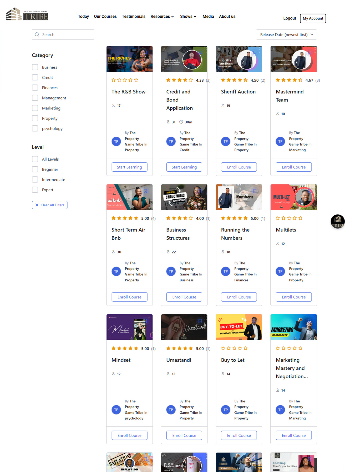
The live course catalog today — the module list traces directly back to the interview findings.
The Instructor Trade-off
Instructor research surfaced a real constraint that shaped the whole product: instructors never got a portal or any way to interact with students inside the platform. Course content was uploaded by our internal team; any commentary or support a student received came from a system administrator, not from the instructor who taught it. That's a real trade-off, not an oversight — and it directly shaped the personalisation and content-structure decisions in the next section.
The Core Design Challenge
How do you convert a live event into an online platform that people actually stay with?
A live masterclass has a room full of energy, an instructor reading the crowd, and peer pressure to show up. An LMS has none of that by default, just a list of videos. The design question underneath every screen was: what replaces the things a live room does for free?
Personalisation For Return Visits
The logged-in "Today" dashboard greets the member by name and resurfaces their in-progress courses, recommended next courses, and their own trainers, so there's a reason to come back that isn't "start the video from the beginning."
Short, Structured Content
Courses are broken into short modules, often under 10 minutes per lesson, with visible progress tracking, rather than long-form recorded lectures, directly answering the "this is too much to take in" pattern from the interviews.
A very high engagement rate for a self-paced platform with no live instructor in the room.
Selected Screens
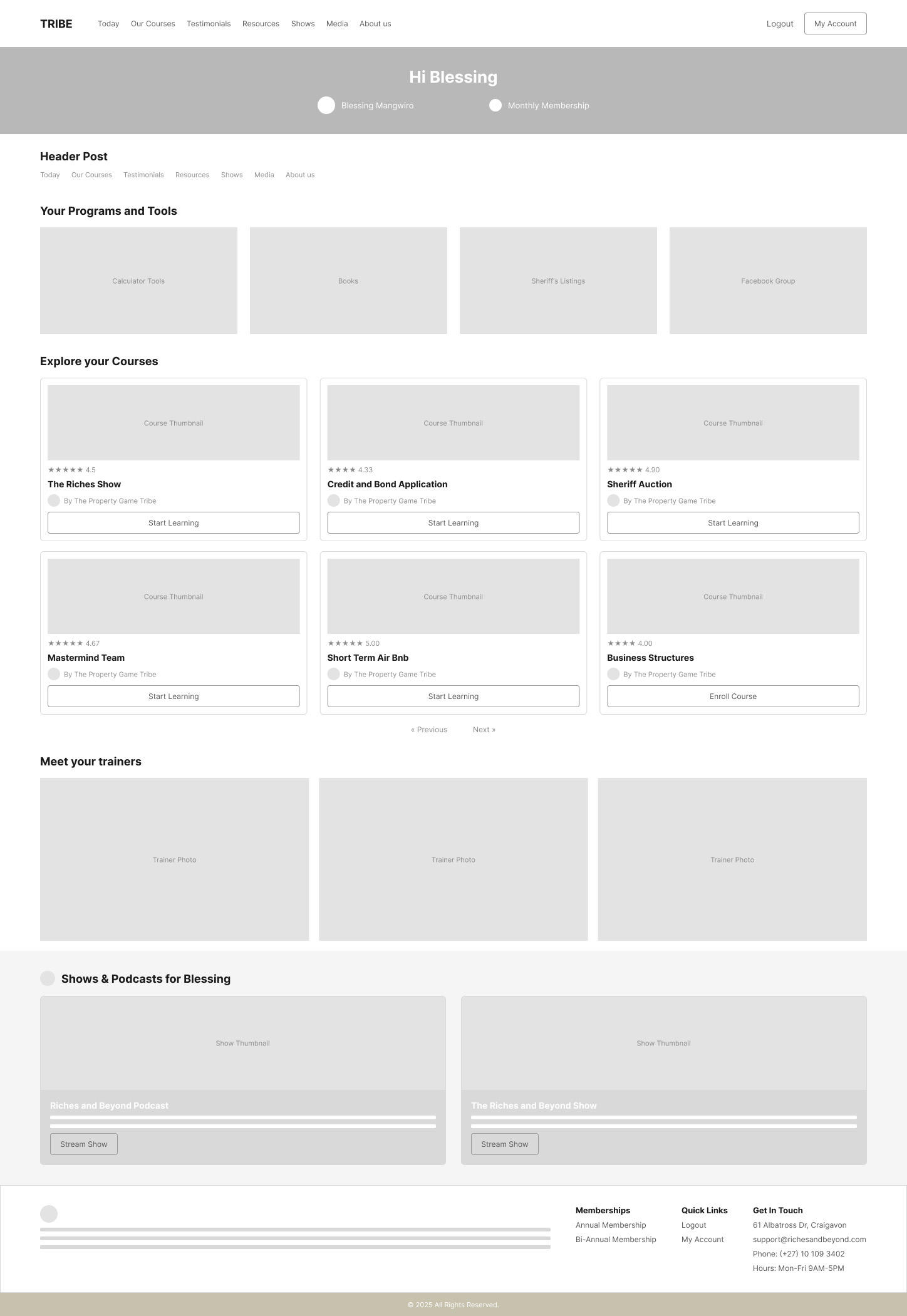
Low-Fidelity
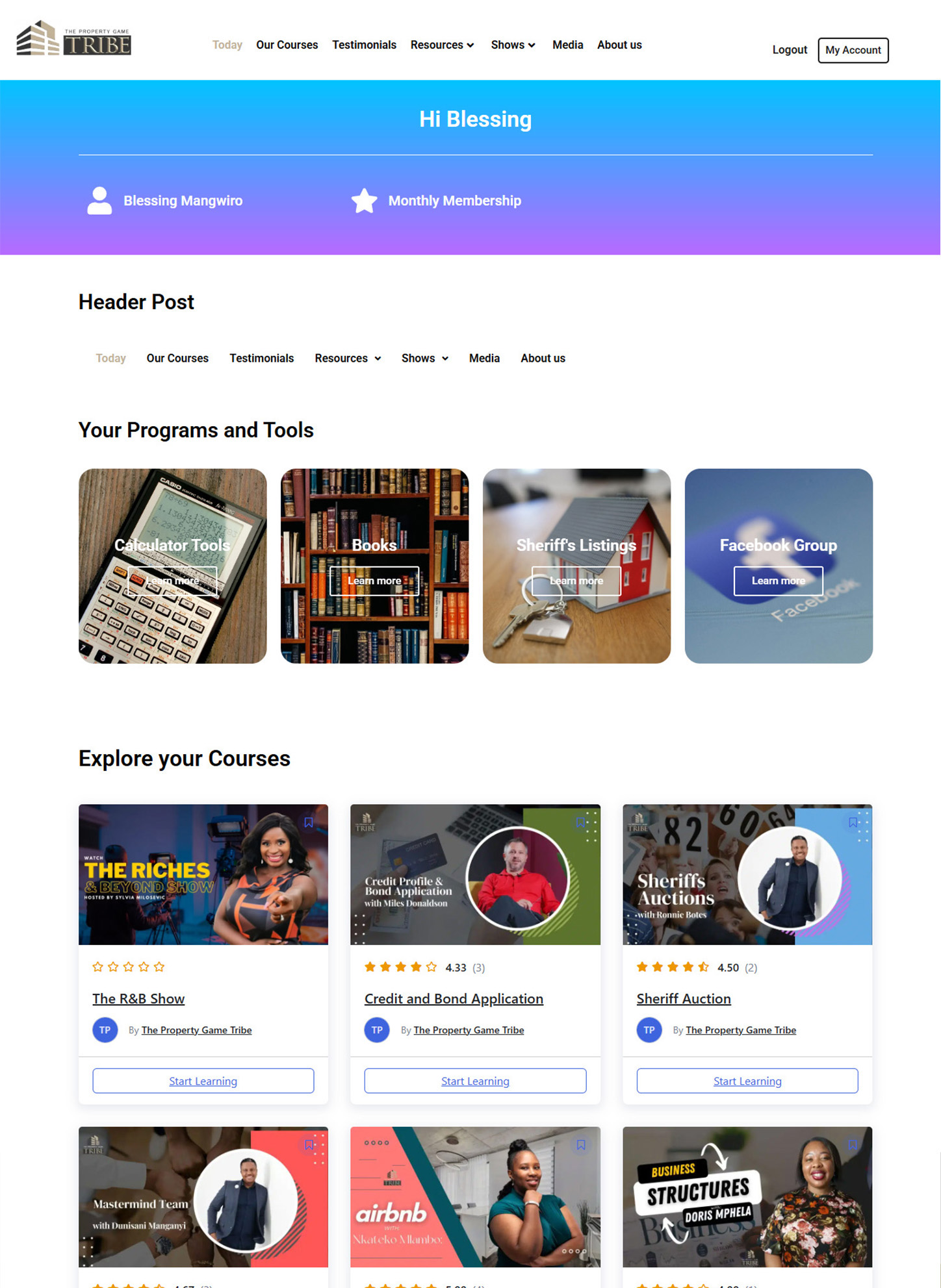
High-Fidelity
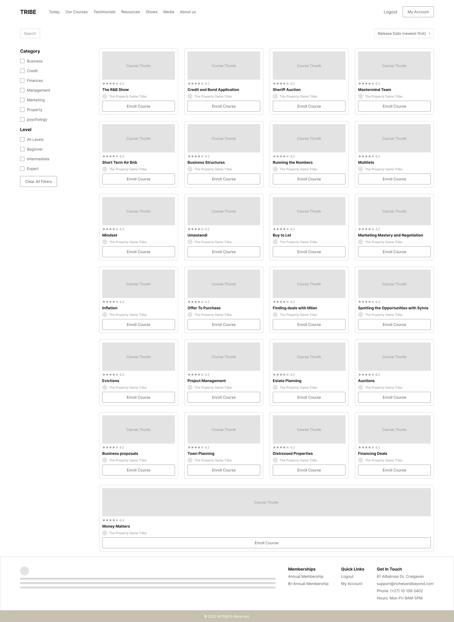
Low-Fidelity
High-Fidelity
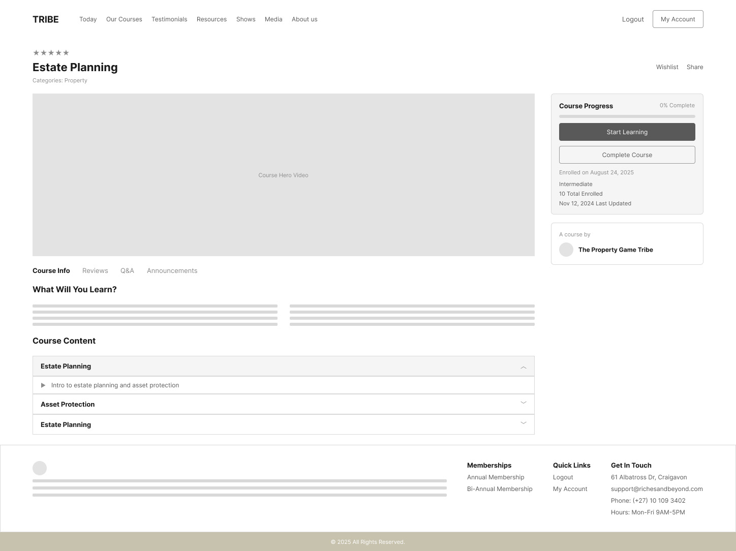
Low-Fidelity
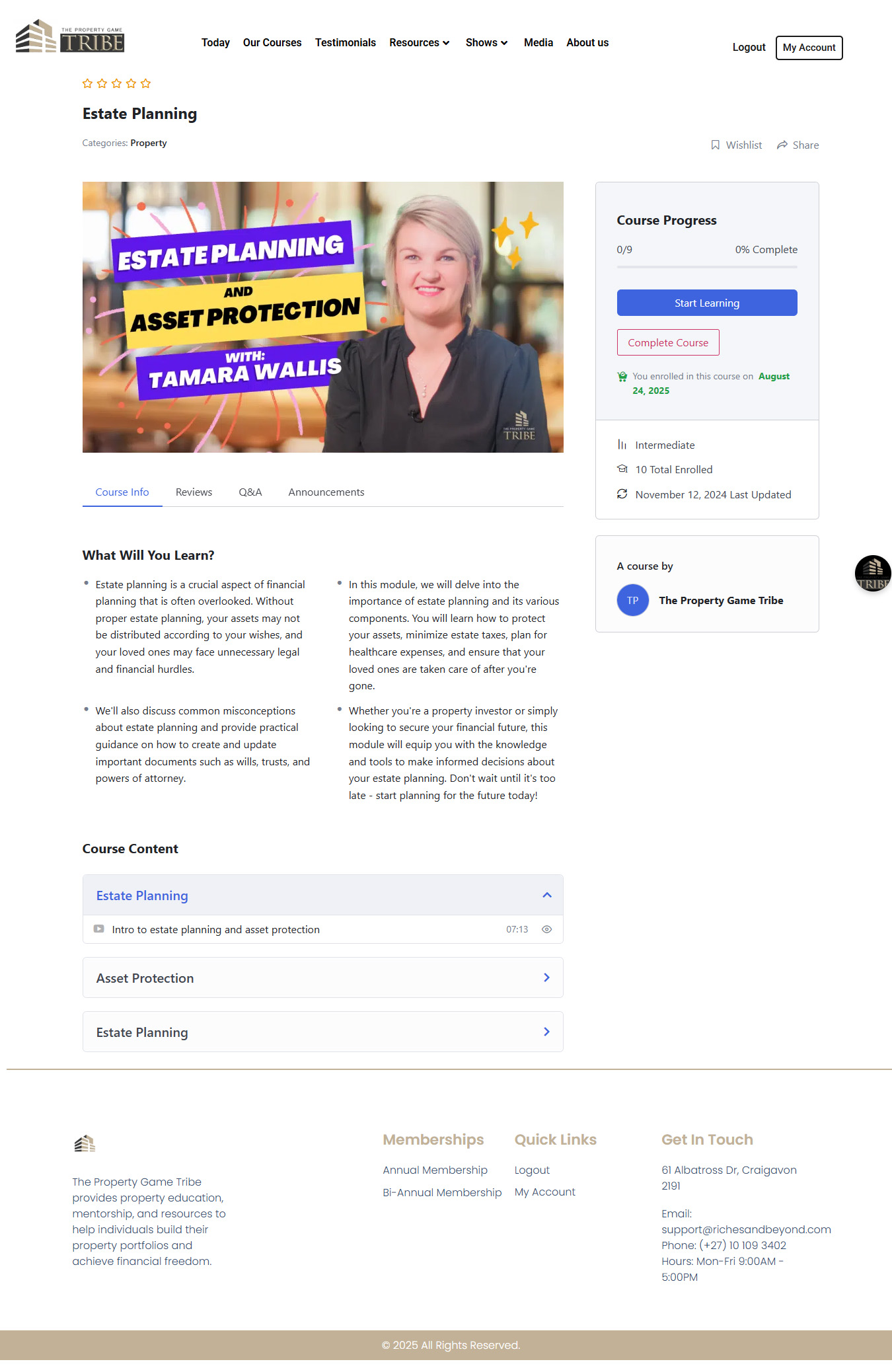
High-Fidelity
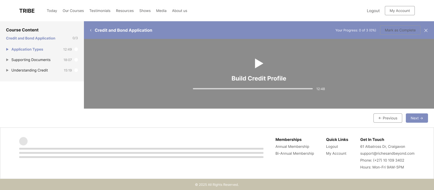
Low-Fidelity
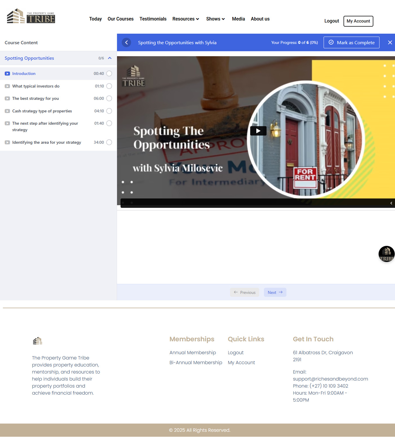
High-Fidelity
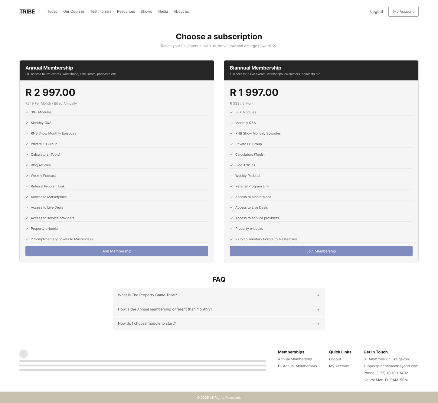
Pricing (Wireframe)
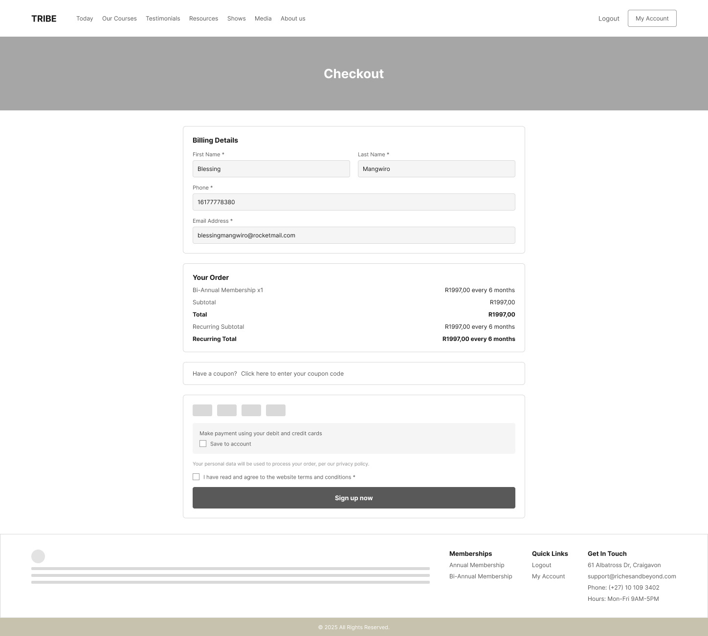
Checkout (Wireframe)
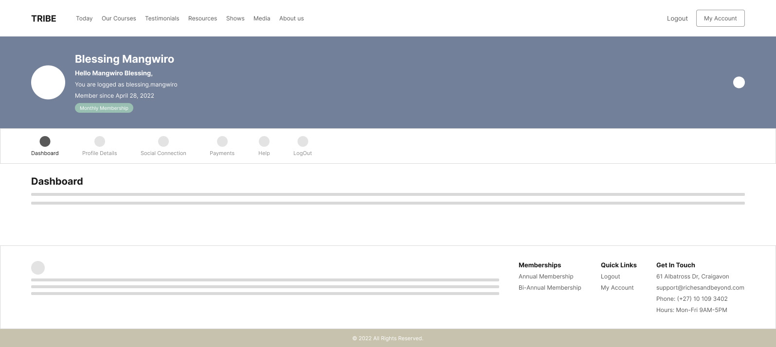
Low-Fidelity
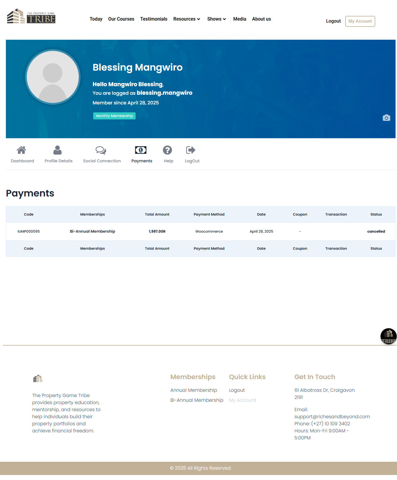
High-Fidelity
My Role, Specifically
That's an unusually wide span for one person, research, UI design, video direction and production, and engineering collaboration, on one shipped, paid product. Most designers point to one of those. I did all four.
UX Research
Designed and ran the ~200-interview study above, across remote and in-person channels, including the stakeholder/instructor interviews.
Product & UI Design
Owned the front-end design for the platform: course catalog, course detail template, the in-app video lesson player, membership/pricing, checkout, and the member account area.
Design-To-Engineering Handoff
Worked directly with the two web developers to get designs implemented inside Moodle, translating design intent into what the platform's module system could actually support.
De Facto Design & Content Lead
With no PM on the team, I was the one making the call on design decisions and what content shipped, reporting up to the IT Director.
Video Direction & Production, End To End
Every course trailer on the platform, I was lead videographer and director on all of them. A 3-camera static setup plus microphones and lighting in the recording room, directing a co-videographer who handled cinematography, then editing and finishing every trailer myself.
- • Premiere Pro - the edit, and combining with After Effects work
- • After Effects - motion graphics and effects
- • DaVinci Resolve - color grading
- • Banners and thumbnails were handled by the team's graphic designer
A showreel of the course trailers I directed, shot, and edited for the platform.
Constraints & Trade-offs
Two real constraints worth naming plainly, unresolved trade-offs are usually more interesting than a clean success story.
Building On Moodle, Not From Scratch
The platform's payment system, security model, and underlying architecture were already decided before design started. Ideas that would've worked in a from-scratch build had to be reshaped to fit what the LMS could actually do, a real design-to-engineering negotiation, not just a handoff.
No Instructor Portal
Decided (or inherited) early, this meant every piece of learner support had to be designed to work without the instructor being reachable in-product, directly shaping the personalisation and content-structure decisions above.
03The Solution, Live
The screens below are the actual live product today, not mockups. The pricing details and content library have evolved since 2022–2024, but the structure, short courses, a member dashboard, a membership-and-checkout flow, is the one I designed.
Membership & Access
A single, clear path from "I don't know where to start" to "I'm in a course," addressing the accessibility problem head-on.

The membership page today, the same "everything a member gets" structure I designed the layout for.
Course Detail Template
Every course uses the same template: a trailer, a plain-language "what you'll learn," and a short, numbered list of modules with visible progress, the short-and-structured pattern from the research above, applied consistently across the whole catalog.
The Sheriff's Auction course page, one of the modules that came directly out of the interviews.
04Outcome
Formally Accredited, Not Just Informally Credible
The platform holds official regulatory accreditation from both Services SETA (South Africa's Sector Education and Training Authority) and the QCTO (Quality Council for Trades and Occupations). Worth leading with this over a commercial award, it's a harder, third-party-verified credential that speaks directly to trust in a financial-education product.
Real Outcomes, From The Public Testimonials Page
These are live on the site today, real member results standing in for the video testimonials I filmed but couldn't track down for this write-up.
"From zero to a R60 million development in two years."
"7 deals closed in 6 months."
"23 years old, invested in a multi-let property."
05What Made This Hard - And Where It Led
I moved into this role - UX researcher and designer - while still primarily a multimedia designer, without prior formal UX research training, on a team that had never worked with a UX researcher before. I knew how to research web interfaces, but not with any formal methodology behind it.
That gap is what sent me to Iowa State for an MS in Human-Computer Interaction afterward. I'd found the discipline I wanted to go deep on, and went and got the formal training to back up what I'd been doing on instinct.
Riches & Beyond is where my product design career started. Everything I've built since, including the AI-focused work elsewhere on this site, sits on top of the research instincts, the design judgement, and the comfort shipping real, imperfect, live products that this project taught me first.
Key Takeaway
A real project, a real gap I noticed in myself, and a concrete action taken to close it. That throughline, not a polished portfolio piece, is what this project is actually proof of.